The redesign of PulseMove Tracker app from Pulse Fitness.
Overview
Client
Pulse Fitness & Staffordshire University
Team
Stuart G (Product Designer)
Duration
Jan 2020 - April 2020
My Role
User Research - Questionnaires & Product Research
UX Audit
Wireframe lo-fi generation
Wireframe prototyping
Usability testing and feedback sessions
Rebrand & hi-fi concepts
The Problem
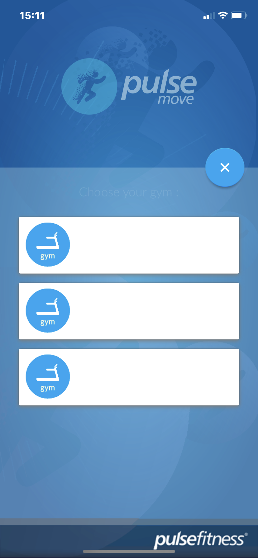
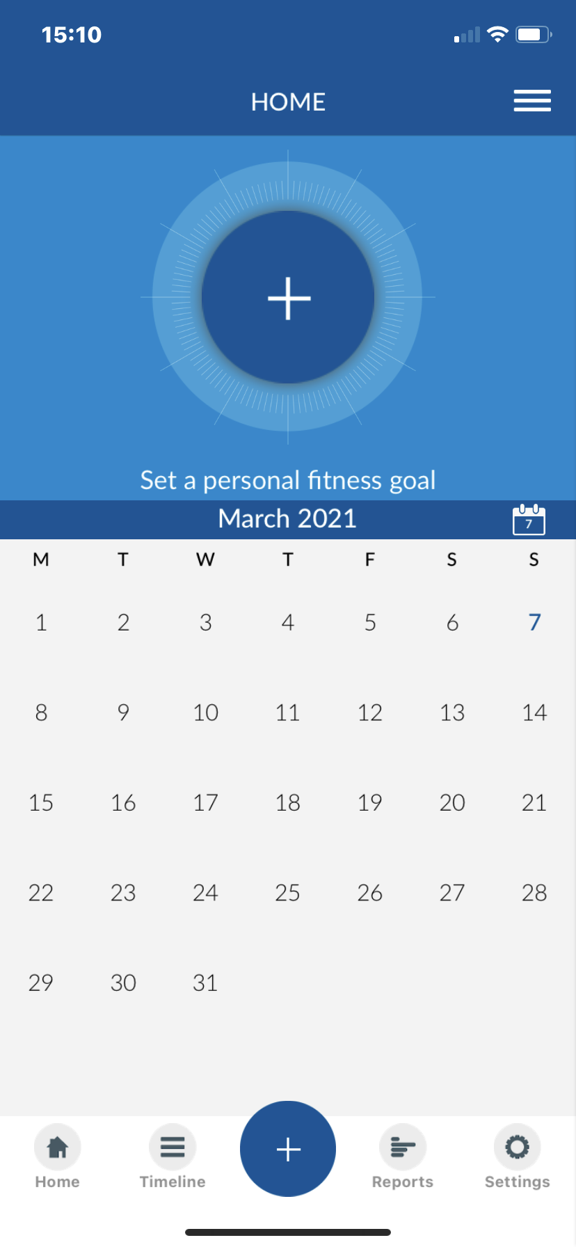
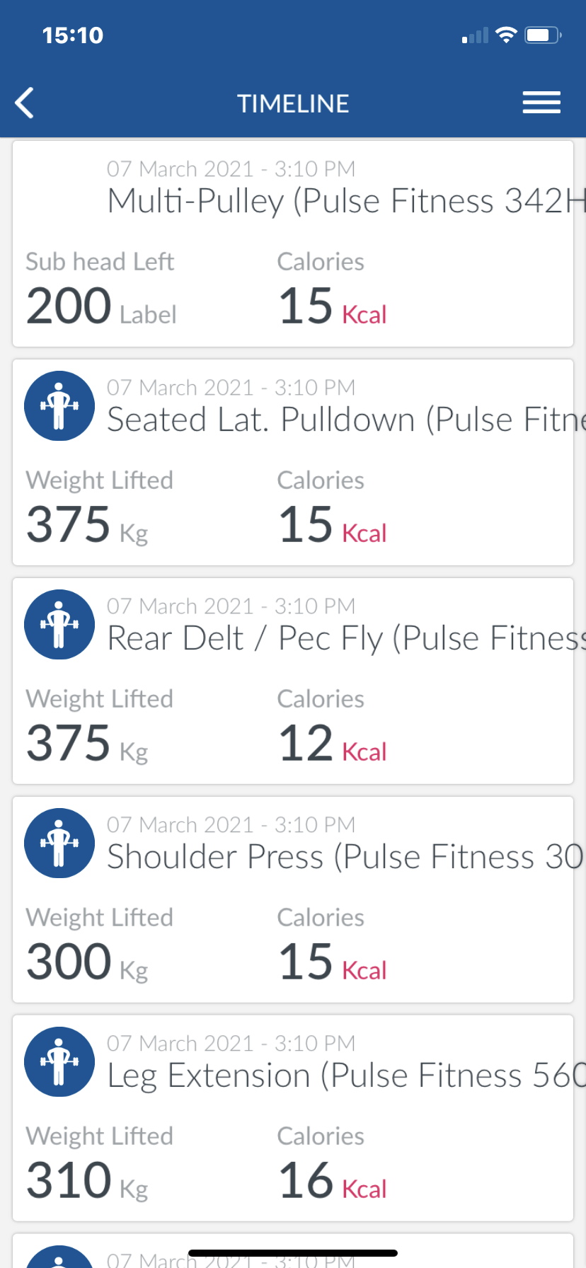
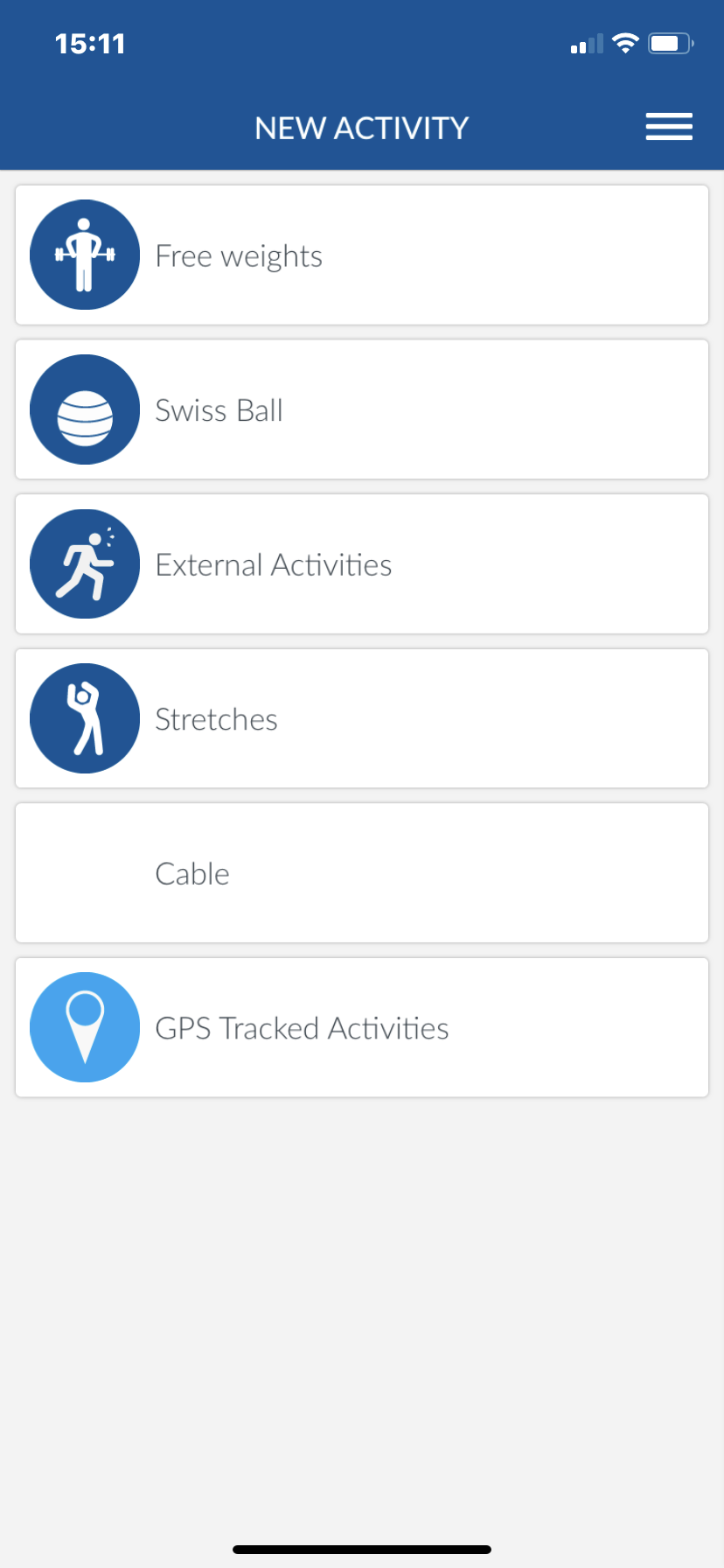
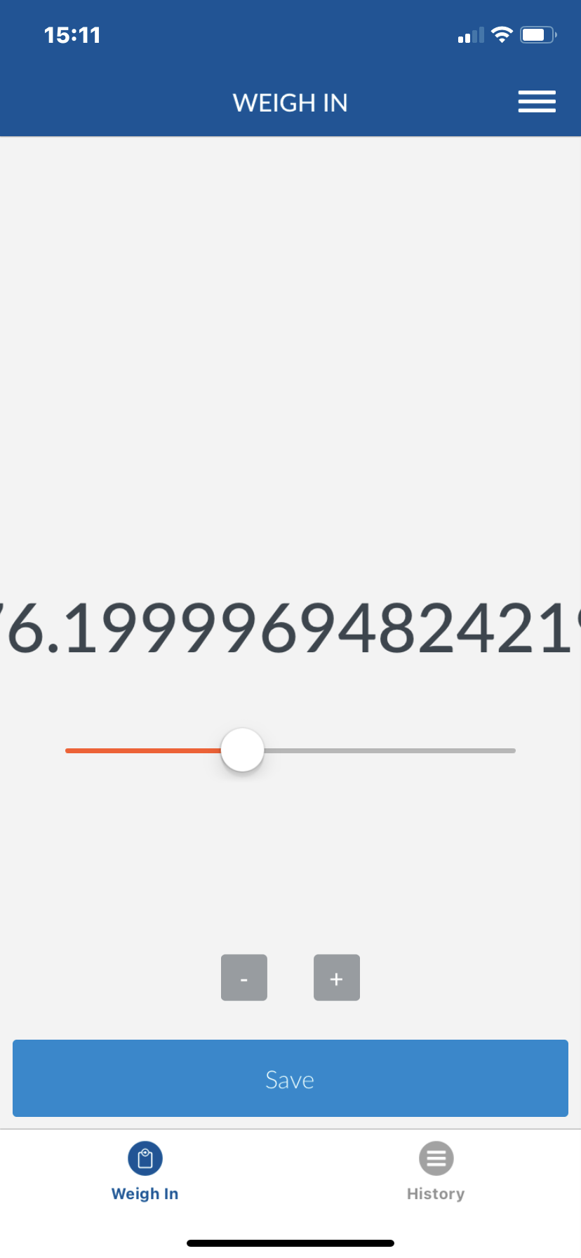
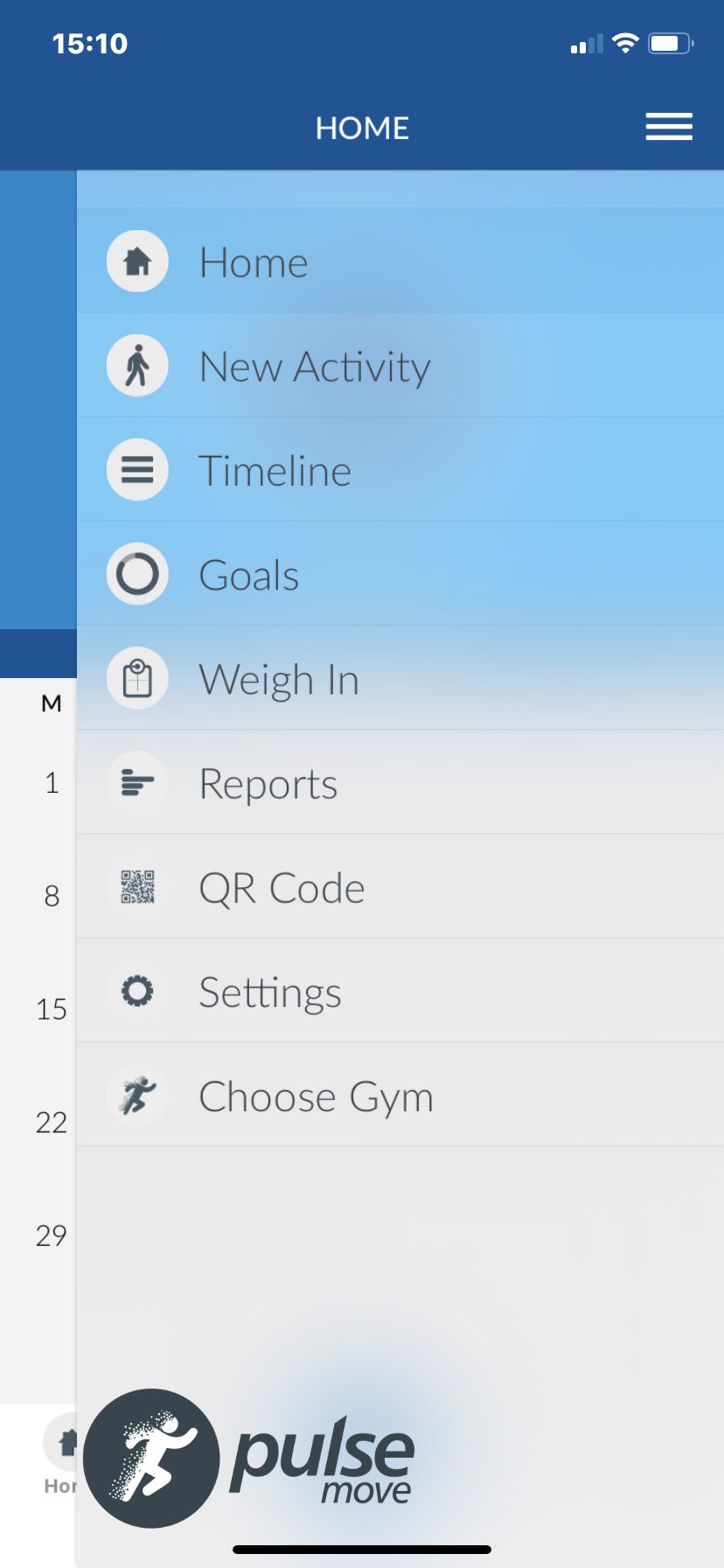
PulseMove is a gym tracking ecosystem, tracking user data throughout their workouts. The PulseMove Tracker app received 1 star reviews on the Apple App Store and Google Play Store. Pulse Fitness tasked me to perform an UX Audit to find out why the app was failing. While doing this UX Audit Pulse Fitness requested that I come up with a full new rebrand for the app.
The Process
UX Audit Overview
Review of Apple Analytics & Google Play Console statistics
Understanding previous work undertaken
User Reviews & Stakeholder Interviews
Validation of Results - Cognitive Walkthroughs
Organisation of Data - Live Usability Feedback, Questions to developers,
Review of Trends and Tendencies
Overview of results and suggested changes
The full UX Audit report can be downloaded here for light reading.
The Solution
When going through a detailed UX Audit, it was clear that the main issue sat with the previous work that was under taken. It was clear that the foundations of the PulseMove app was built on the lack of effective UX flow. From the cognitive walk throughs and user feedback, the app is not easy to use, lacks clarity and the app showed many graphical and functional bugs.
Once I had found the main problems with the PulseMove app, I needed to understand more about the back end and database breakdown. From here it was clear that the app was incorporating connectivity to old Pulse Fitness technology which caused irregular behaviour.
The best case for this app was to start a fresh to solve the broken UX flow of the app, by doing this would solve the fundamental issue of the app first before moving on to less important aspects. All features were kept but moved around to make it easier for the user.
Once this Lo-fi wireframe was completed, I based the new branding on a more modern cutting edge look for the brand inside Pulse Fitness. This was reported back to the company with my suggestions on changing and updating the app. From here example Hi-fi images were done as a proof of concept.
Lo-Fi Wireframe
After the UX Audit report was undertaken, I then went and redesigned the UX Flow process for the new updated concept I was proposing. Please see the full flow image below.
PulseMove Rebrand
As requested, I produced a concept for a new rebrand of PulseMove, this design is more modern and fits a more 2020 gym look and feel.
Hi-Fi Final Design
As a part of the UX Audit, I was tasked to create UI examples for the new App concept. This was to give Pulse Fitness an idea of what the new app could look like.


